Don Preziosi
Advertising Icons
There are many techniques used by advertisers to sell products, services, or to build a corporate identity for a client. They can use celebrity endorsements, dramatic demonstrations, or slice of life (wherein we look at a “real” life situation that the product enhances). However, none of these techniques seem to be ingrained in our collective consciousness as strongly as the advertising character that becomes an icon. Some of them come and go after a few years, but the most memorable ones last for decades or longer.
Postcards, being one of the mediums used by advertisers, have recorded many of the most famous advertising icons on both individual cards and in sets and series. Here are ten famous advertising characters from the twentieth century, several of which have survived for a hundred years or more.

GOLD DUST TWINS – These African American twins, Goldie and Dusty, were the characters featured on the N. K. Fairbanks Soap Company’s packages and advertisements for soap and cleaning products. They first appeared in the 1890s and continued until the 1930s when the company folded. In their day they were one of the most recognizable advertising trademarks. The company issued a set and a few individual holiday ad postcards with the twins.

CAMPBELL KIDS – These kids began their careers in 1904 when the artist Grace Wiederseim (later Drayton) sketched them for a streetcar ad. The Campbell Soup Company used their images on everything: bowls, ties, dolls, and postcards. Their use by Campbell has waxed and waned over the years, but they are still around a century later and can be found in sets of postcards at both ends of their century. Weiderseim/Drayton was one of the most successful female illustrators and her work can be found on scores of postcards in addition to Campbell Soup cards.
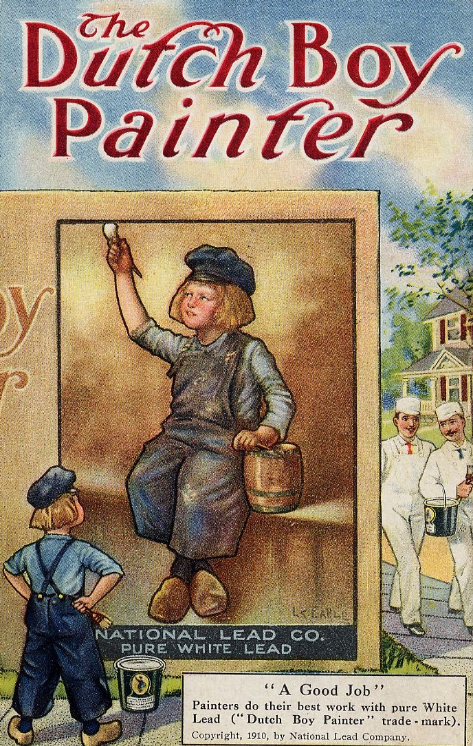
DUTCH BOY PAINTER – Noted portrait painter Lawrence Carmichael Earle created this advertising icon in 1907. The National Lead Company commissioned Mr. Earle to paint a portrait of a Dutch boy as a trademark for their paint. He appears on many advertising postcards. Although the look of the boy has changed a few times over the last hundred years, he is still one of the most recognizable trademarks in the world. The lead in the paint, however, was dropped a while ago!
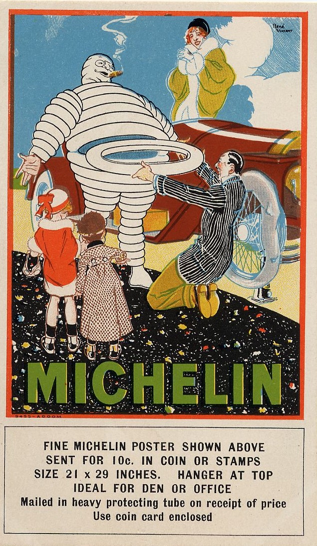
MICHELIN MAN – Michelin Man (known as Bibendum in Europe), was created in 1898 by French artist O’Galop (pseudonym of Marius Rossillon) for the Michelin Tire Company. André Michelin commissioned the creation of this icon after his brother, Édouard, noted that a display of stacked tires looked like a human. Michelin Man, too, has changed over the last century. He no longer needs glasses, has given up smoking cigars, and has slimmed down in keeping with a more health-conscious climate.

Mr. PEANUT – This anthropomorphic peanut dressed in formal attire complete with top hat, monocle, white gloves, spats, and a cane is ageing well. In 1916, the Planter’s Company sponsored a contest for a brand icon. A Virginia schoolboy, Antonio Gentile, won the $5 prize for his little peanut person. A commercial artist added the fancy togs and Mr. Peanut was born. Primarily, Mr. Peanut is found on postcards showing images of the 1930s to 1960s Planters Peanuts stores.
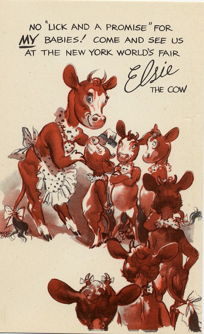

ELSIE the COW – Elsie was created in the 1930s as a wholesome spokescow for the Borden Dairy industry. She received much fan mail and made a live appearance at the 1939 New York World’s Fair. Her appearance at the fair resulted in a postcard set and a few individual cards. She even starred in a movie. Elsie is still among the most recognizable product icons.
TONY the TIGER – Martin Provensen, a children’s book illustrator, designed Tony in 1952. He won a public competition against three other potential mascots: Katy the Kangaroo, Elmo the Elephant, and Newt the Gnu. Tony and his “They’re Grrreat!” catchphrase have been the longtime symbol of Kellogg’s Frosted Flakes. Over the years Tony has evolved into a much more athletic-looking tiger.
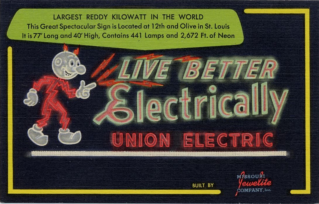
REDDY KILOWATT – Ashton B. Collins, Sr., of the Alabama Power Company created Reddy in 1926. With his lightning-bolt body and light bulb nose, Reddy became the corporate spokesperson for electricity generation in America for over six decades. He is on a variety of postcards for different electric companies.
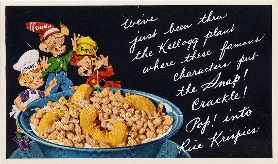
SNAP! CRACKLE! and POP! – These elfish characters were created in 1932 by illustrator Vernon Grant. He heard a Kellogg’s radio ad that said, “Listen to the fairy song of health, the merry chorus sung by Kellogg’s Rice Krispies as they merrily snap, crackle, and pop in a bowl of milk. If you’ve never heard food talking, now is your chance.” He drew three elves, named them after the sound described, and presented them to Kellogg’s. They bought the idea immediately. The boys are still frolicking today, only with a fresh look.

SPEEDY ALKA SELTZER – Originally named “Sparky,” Speedy was created by Bob Watkins.
Although Speedy originally appeared in magazines, it was his presence in TV commercials that made him an advertising icon. From 1953 to 1964, he appeared in 212 commercials. Speedy was “laid off” in the late 1960s but was rehired for the American Bicentennial and the 1980 Winter Olympics. Who can ever forget his famous slogan “Plop Plop, Fizz Fizz. Oh, what a relief it is!” Postcards of Speedy are hard to find.
* * *
If and when Postcard History can accommodate the idea of updating or expanding articles like this one, there are more advertising icons we all know.
Here are a few you may remember: the Wendy’s Girl, Pillsbury Doughboy, Ronald McDonald, Energizer Bunny, Betty Crocker, the Jolley Green Giant, and the Marlboro Man.
Share your advertising cards with your fellow readers in the comments below.
Great subject! Don got me interested in “Linen” postcards.
When we visited New York in the late 40’s we went to some radio shows. We kept seeing an attractive woman in a beautiful blue dress. On the subway etc. When we got to the show she sang the jingle Elsie was a famous cow “Moo Moo, Moo” nice memory.
It’s always a good day when you can read a postcard article by Don Preziosi! Thanks Don. Very informative and entertaining – and great cards‼️😀
Great to see the female illustrator from 1904
I remember my grandmother referring to two of her relatives who always seemed to do everything together as the “Gold Dust Twins”.
Thank you for an interesting item and good postcards