Editor’s Staff
Clarence Coles Phillips
and Negative Space
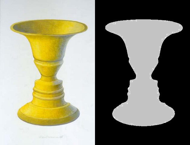
In the art world descriptions are often confusing unless the analysis of the terminology uses visuals to prove the concept being studied. One very confusing concept is negative space. The most common example is the one below. On the left you see what appears to be a yellow vase; on the right you see the profiles of two faces. When the space-equivalents replace each other by changing color, the image changes.
The idea of negative space is an amusing concept that is based on the same optics as inkblots or color-stains. Learning to the point of understanding is fun, especially when it is introduced to children, but the concept is never fully appreciated until it is applied in serious art.
* * *
The world of postcards is much the same as the art world, after all, what is it about the postcard that we collectors most appreciate? This rhetorical question leads this Postcard History lesson to Clarence Coles Phillips. Phillips was one of America’s most successful advertising artists and illustrators.

One of Phillips’s most successful pieces of advertising was a magazine ad for a family set of silverware manufactured by the Oneida Company under the brand name of Community Silver “A Case of Love, at First Sight.” When the Community Silver ad campaign began, the competition among artists for the project was quite exhausting since no room for error existed. The story of Oneida silverware was decades in the making – since 1848 – when John Humphrey Noyes founded the Oneida community in New York based on his theory of perfectionism.
When Phillips won the right to create the ad campaign, he also developed his signature use of negative space. He even changed the way he signed his name. Early on he used C. Coles Phillips to sign his work, after his debut of the fade-away girls, he abbreviated his signature by dropping his initial “C” for Clarence.
Phillips was born in Ohio. In his twenties he attended Kenyon College (Ohio) but left after two years for Manhattan with a goal of making a living with his art. When he arrived in New York he enrolled in night classes at the Chase School of Art where he worked at his only formal art education.
It is unknown where and exactly when, but sometime in 1907 Phillips met J. A. Mitchell, the publisher of Life magazine. Mitchell hired him to be a member of the art department and that association lasted the rest of his life.
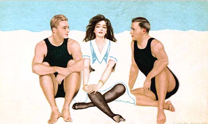
Phillips’s first cover for Life magazine was published on January 27, 1910. It was this introduction to the public that he first presented his fadeaway ladies. A technique that merged a figure’s apparel without lineal differentiation into the background.
This novel approach in “advert-art” was instantly popular and it saved money. Phillips’s designs hid the fact that Life was using fewer colors when printing their covers than the full-color covers that had become the industry standard.
* * *
Coles Phillips lived two very different lifestyles. In public he was quite gregarious and forthcoming with his conversational ideas and designs. He was not, in the phraseology of the day, a social butterfly, but he was always present at a New York social “to-do” to hear the announcements of importance to the art and advertising world. In addition to Life, he also worked for other publications and his work away from Life presented few conflicts.
In private however he was much different. He was the original W. A. H. (work at home) employee. In 1905 he bought a home in New Rochelle, New York and lived there until his death.
Phillips married Teresa Hyde in 1910, a nurse and soon to be her husband’s foremost model. His work kept him busy, but even the busiest people need downtime. Phillips filled his leisure hours by raising pigeons; an advocation he had practiced since age eight.
In 1924 Phillips was diagnosed with renal tuberculosis, and in his last three years he was often bed-ridden or hospitalized because of his illness. In January 1927, when problems with his eyesight made painting difficult, he chose to dedicate himself to writing, but very few of his writings were published. Phillips died at age 47 in June.
Artist and close friend, L. C. Leyendecker, also a postcard artist, eulogized him as an artist “unique in his field, one with a highly developed sense of decoration and color, he was ahead of his time in depicting young American women.”
* * *
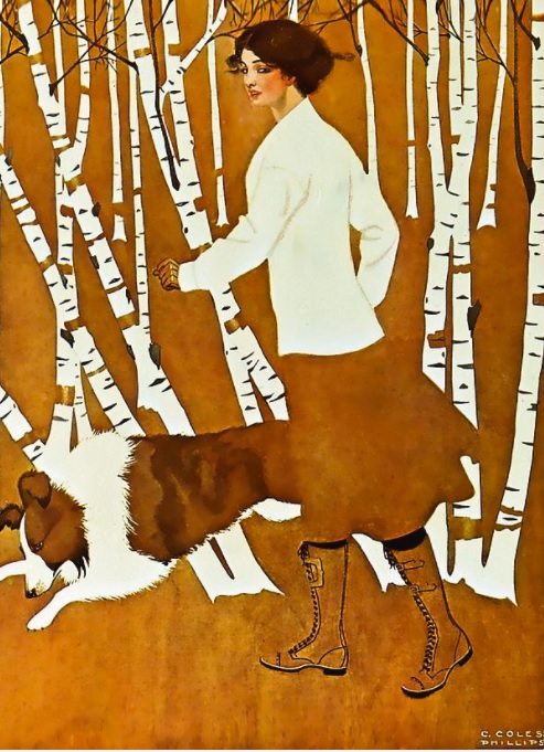
Phillips’s art is still popular today. In the fall of 2020, a boutique publisher of memory (blank) books, used Phillips’s “Autumn Walk” on the cover of books sold most often in stationery stores and museum gift shops.
* * *
Coles Phillips postcards are among some of the most expensive currently collected, and then only by advanced collectors. In the last two to five years, it was not unusual to find dealers asking well above fifty dollars per card. The market has cooled some, but $10 to $20 is still the norm.
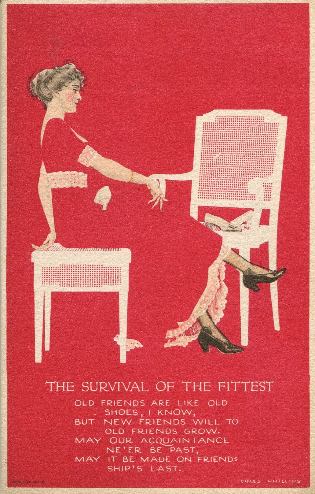
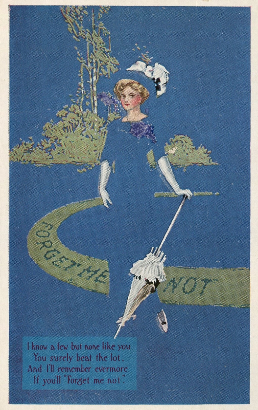
Here is a special treat for Postcard History readers . . . a trio of Phillips’s fadeaways in red, white, and blue.
Wonderful reading…thanks! Can I contribute a small monetary guft
The Life magazine for which Phillips worked bore little resemblance to what the publication became when Henry Luce bought the title in 1936 and unveiled the photo-heavy weekly which was a staple of so many homes until 1972.
Excellent!
For a long time, I have been fascinated by Cole Phillips’ postcards. In my novelty postcard exhibit, I have included one of his fadeaway cards. Seeing his red, white and blue postcards has sparked a new exhibit topic for me. Well done!
I love this group! Always interesting, never takes too much time, save for articles like this that pique my interest to go further. This is amazing! Love the story, love the cards. Every series of articles is like gold in my inbox. Grateful to all the writers and collectors that share what they know and what they have.
What a pleasant surprise to find the concept of negative space explored in postcard art! This is a basic concept used when art historians analyze paintings and sculpture. The use of negative space by an artist can make or break a composition. It really isn’t that complicated -especially when the definition of the term is accompanied by great examples as you’ve shown here. I really enjoyed this article and it’s clever concept of introducing a postcard artist and an important artistic concept at the same time!
Interesting, Thanks for posting. Happy New Year to All.
VERY INFORMATIVE INFORMATION OF HIS PERSONAL AND PROFESSTINAL LIFE.
ENJOYED READING & SEEING YOUR POSTCARDS AND THE HISTORY OF THE ARTIST.
Thanks for posting this. I did not know that Phillips was also a postcard artist.